Monday, 22 November 2010

Colour/Simple but effective


Some Minimalist posters designed by a man who goes by the flickr name of slaterman23.
the more i see of minimalist graphic design the more i love it, the way you can create the perfect image of a person/superhero with something as simple as their eyes, posture or even facial hair just amazes me also each one has a great use of colour. 

all images can be found on blogof.francescomugnai.com

What is graphic Design?


Simple but effective, a good use of colour and composition in this poster, it gives the idea of a city using just line and colour.


A set of images of some really interesting packaging found on blogof.francescomugnai.com


a Series of posters designed by Chris Nolan for the film Inception, one of my favourite films this year, the film itself has a very complicated and deep storyline and these posters summarise that storyline really simply and well, a very nice and creative series.

10 Examples of good use of colour


these are  series of cooks designed by Lindsey Jayne Hayes i think the use of bold colourful text against a tinted same colour background works incredibly well and makes the type stand out twice as much.


A beautifully coloured vinyl cover i found on Francesco Mugnai's blog


A series of images by a designer who goes by the name Minga, the use of CMYK again a dull background works really well and the images are really nice to.


a poster design by chris Lewis of all his favourite songs very simple use of colour and layout yet very effective.


Two pieces of design by Austin Taylor one using very beautiful simple basic colours the other using a different approach by still very aesthetically pleasing.


Two images from a designer named Benjamin Koh's really nice used of different variations of blue an green especially while having neutral packaging.


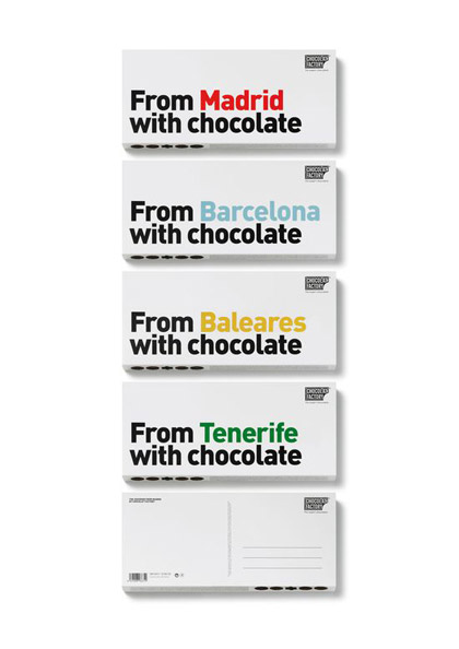
A couple of chocolate packaging design found on Francesco |Mugnai's blog

(All images found through http://blogof.francescomugnai.com)


An Image created by a designer named Matt Stevens.


Friday, 5 November 2010

Metonym

A metonym is a word that denotes one thing but refers to a related thing. i.e. the Eifel tower  because it is something that every one relates to Paris instantly.


Visual synecdoche

a visual synecdoche is one thing that represents some thing else as a whole for instance the double decker red busses in London.


Visual Metaphor

an example of a visual metaphor would be the big apple representing new york


Anamorphic type visual language


Wednesday, 3 November 2010

No News is Good News

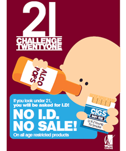
this is a poster i have found about under aged drinking, targeting children not being able to buy alcohol or cigarettes i quite like the style they've chosen to use, very simple.